
Mass Effect: Andromeda
“Research and Development”
Feature Redesign
Software: Photoshop, Illustrator, After Effects, Sketch, Premiere Pro
This project is all about breaking down “Mass Effect: Andromeda”’s Research and Development feature, and redesigning an alternative to the current interface.
Research, Development, and a lot in Between
In order to understand what was not clicking for me in current design, I reverse engineered the R&D feature into a wireframe and replicated the flow that player would have to go through - from accessing the R&D console, through developing desired blueprint and finally crafting the item in the separate menu.
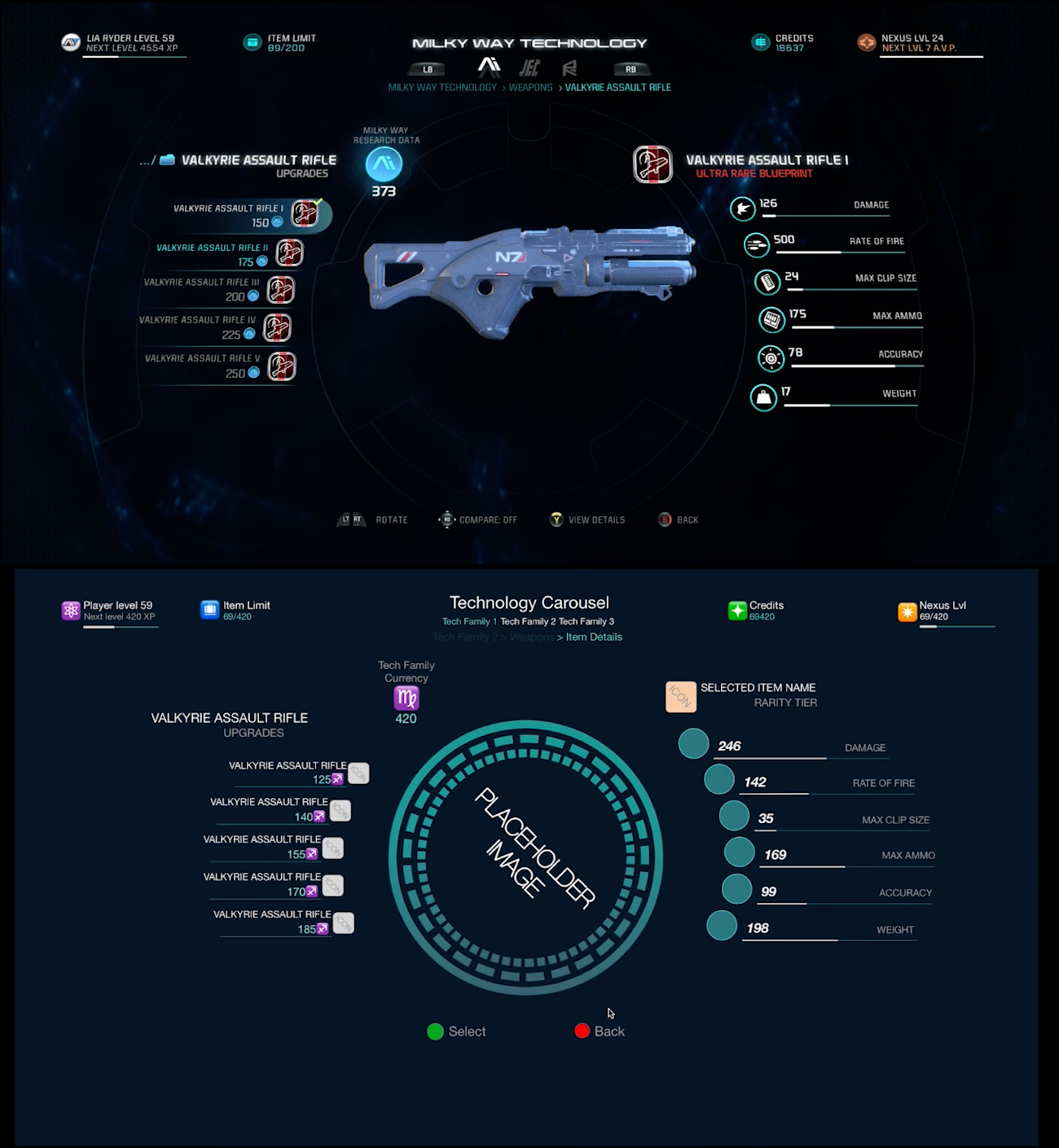
As you can see on the full wireframe of Research and Development below, player has to go a long way from the initial terminal screen to the research of the blueprint, and then navigate all the way back to development screen. This approach, in my opinion, was ready for some improvements.
Conclusions
Original design of R&D feature has solid design principles, but suffers from navigational issues that make the overall experience confusing.
What it does well
Design featuring an asset in a center of the screen remains consistent with the most of the game
Player is always presented with information they need in more or less the same space on the screen
What could improved upon
Navigation across the board - backtracking between two separate screens takes a lot of time and is not intuitive (it takes 16 screen transitions from entering the R&D terminal to getting back to it with developed item)
Player is tasked with holding a lot of information in memory - name, level of the item, tech tree it came from - with no sorting and filtering options
The How and Why of Redesign
Core Rules
First and foremost - don’t take away the core features. All the upgrades, slots, tech trees remain intact. It was important for me to remain connected with games design principles, like big shiny centrepieces and holographic space vibe of the menus.
Limitations
No game changing features are added - no new modes of sorting/filtering, or direct crafting from the Research branch. I wanted to say as close to the identity of the original as possible to the separation of The R and The D as well as the colour palette remains intact.
Research *AND* Development, together at last
Few iterations later I created a new flow in Sketch, where I reduced number of screens and by doing so I put two branches a little bit closer together.

Patch notes - what has actually changed?
Navigation is greatly improved - its much harder to get lost now thanks to simplified R-to-D gameplay loop
Reduced clutter in the lists - player only ever looks for an item name, never for particular level or version, these can be selected from separate screen
All information about an item are now in one screen, removing the need for screen duplicates
Tech trees and item categories are now icons instead of text to make them easier to identify and reduce the on screen text
Research stat upgrades are now limited to only immediate level, to avoid decision fatigue


